- Advertisement -
The US population map provides an insightful look at how people are spread across the United States, illustrating variations in population density from state to state and county to county. With the United States population density map, you can easily identify high and low population density areas in the USA, as well as the most densely populated cities and regions. These maps, including the population density map USA by county and the US census population density map, reveal how population density shifts across urban and rural areas, showing both densely packed urban zones and sparsely populated rural stretches. From population heat maps to detailed comparisons of US population density per square mile, these resources paint a vivid picture of America’s demographic landscape, making it easy to see where people are concentrated and where open spaces remain.
US Population Density Map 2024
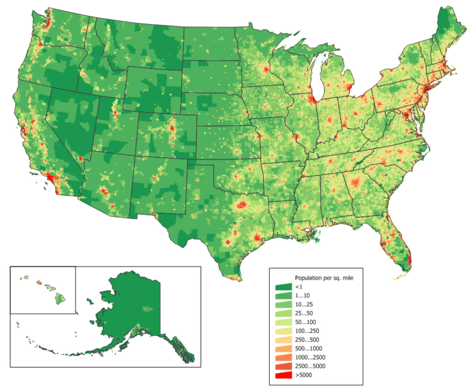
 U.S. population density map by county, shaded from green to red by density per square mile
This map shows the population density of USA counties, with a gradient from green (low density) to red (high density). USA population density map 2024 clusters can be observed along the East Coast, California, and major metropolitan areas, while large green areas in the Midwest and West reflect lower population densities.
The U.S. Population Density Map by Block Level
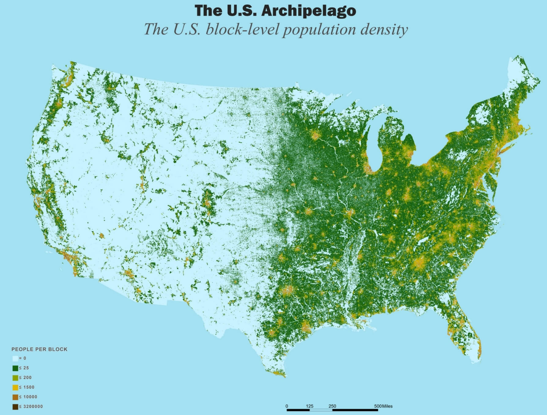
 U.S. block-level population density map showing people per block.
This map illustrates population density across the US at the block level. Dense urban areas, shown in dark green to orange, indicate higher concentrations of people, especially in the Northeast, Midwest, and West Coast. Light areas represent sparsely populated regions, highlighting the uneven distribution of population across the country.
Brief information about United States
The United States, with a population of over 330 million, is one of the most populous countries in the world, behind only China and India. Its population is extremely diverse, with people of various ethnic backgrounds, including European, African, Asian and Latin American, reflecting a rich history of immigration. The country occupies a large geographical area in North America, from the Atlantic Ocean in the east to the Pacific Ocean in the west, encompassing a variety of climates, cultures and landscapes that contribute to its distinct regional identities.
 Golden Gate Bridge, San Francisco, California – United States
Founded in 1776 with the signing of the Declaration of Independence, the United States became a nation after gaining independence from British colonial rule. Throughout its history, it has experienced rapid growth and expansion, marked by key events such as the Civil War, which ended slavery, and the Civil Rights Movement, which pushed for racial equality. Today, the US is home to a wide range of ethnic groups, with white Americans being the largest ethnic group, followed by Hispanic, black and Asian communities. English is the primary language, although Spanish is also widely spoken. Religion plays an important role, with Christianity being the dominant faith, although the country is also home to practitioners of Judaism, Islam, Hinduism, Buddhism and many other religions, reflecting its freedom of religion.
The capital of the United States is Washington, D.C., on the east coast. However, New York City is the largest city by population and serves as a global financial and cultural centre. The US economy is the largest in the world, driven by a mix of technology, finance, healthcare and entertainment. Its economic strength is reflected in its role as a leader in global trade, technological innovation and finance. The US dollar is the world’s most important reserve currency, and American companies such as Apple, Microsoft and Google are among the most influential in the world. Despite economic challenges, the country remains one of the world’s most powerful economies, with a high GDP per capita and a dynamic workforce.
Where is located the United States on the World Map
 Where is the United States on the World Map
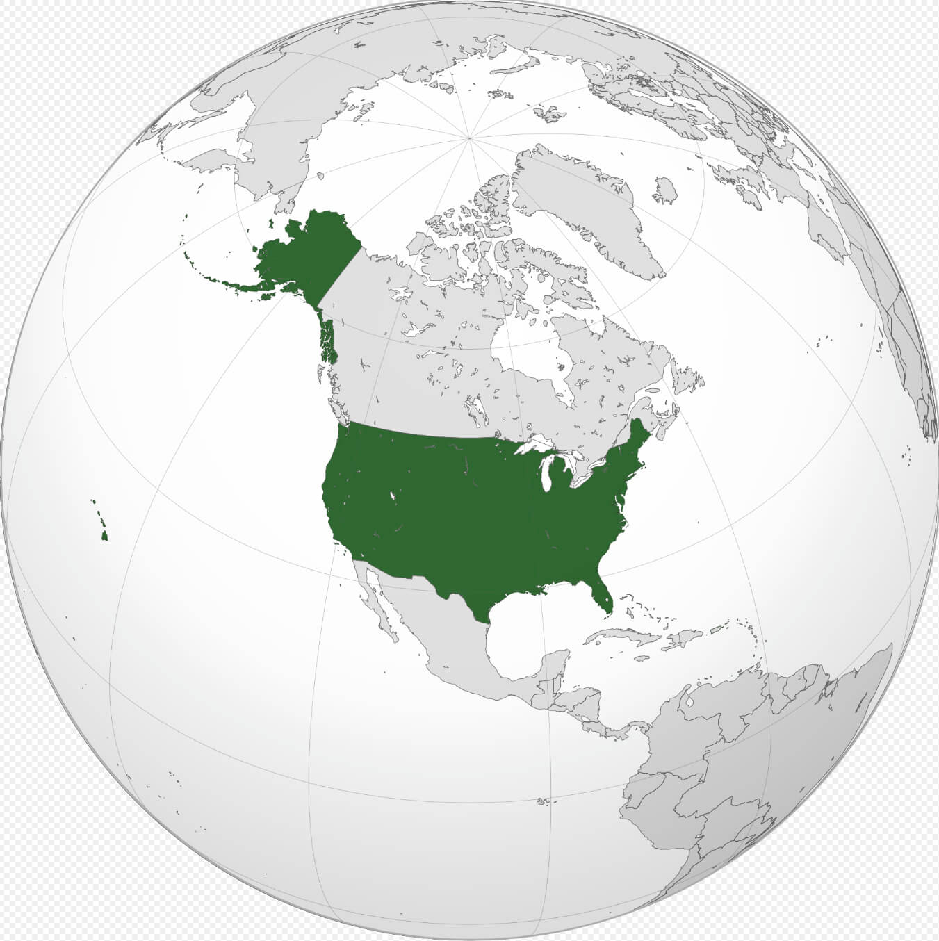
The United States is located on the continent of North America, between the Atlantic Ocean to the east and the Pacific Ocean to the west. It shares its northern border with Canada and its southern border with Mexico, and covers a vast geographical area from the Arctic in Alaska to the tropical climate of Hawaii. The mainland lies between approximately 24° and 49° north latitude and 66° and 125° west longitude. The US also has several territories, including Puerto Rico in the Caribbean and Guam in the Pacific, which extend its reach beyond the mainland.
On the world map, the United States is located in the Western Hemisphere, mainly in the North American region. Alaska, the largest state in terms of area, lies to the north-west of Canada and is closer to Russia than to the continental U.S. Hawaii, on the other hand, is an archipelago in the central Pacific, far south-west of the U.S. mainland. The country’s vast expanse and multiple time zones, from Eastern to Pacific, underscore its geographic diversity and influence, stretching nearly 3,000 miles (4,800 kilometres) from coast to coast. This positioning makes the US a strategic location for international trade and travel, with close links to both Europe and Asia.
Here are some statistical information about the United States:
Area: 3,796,742 sq mi (9,833,520 km2)
Population: 334,914,895 (2023 estimate)
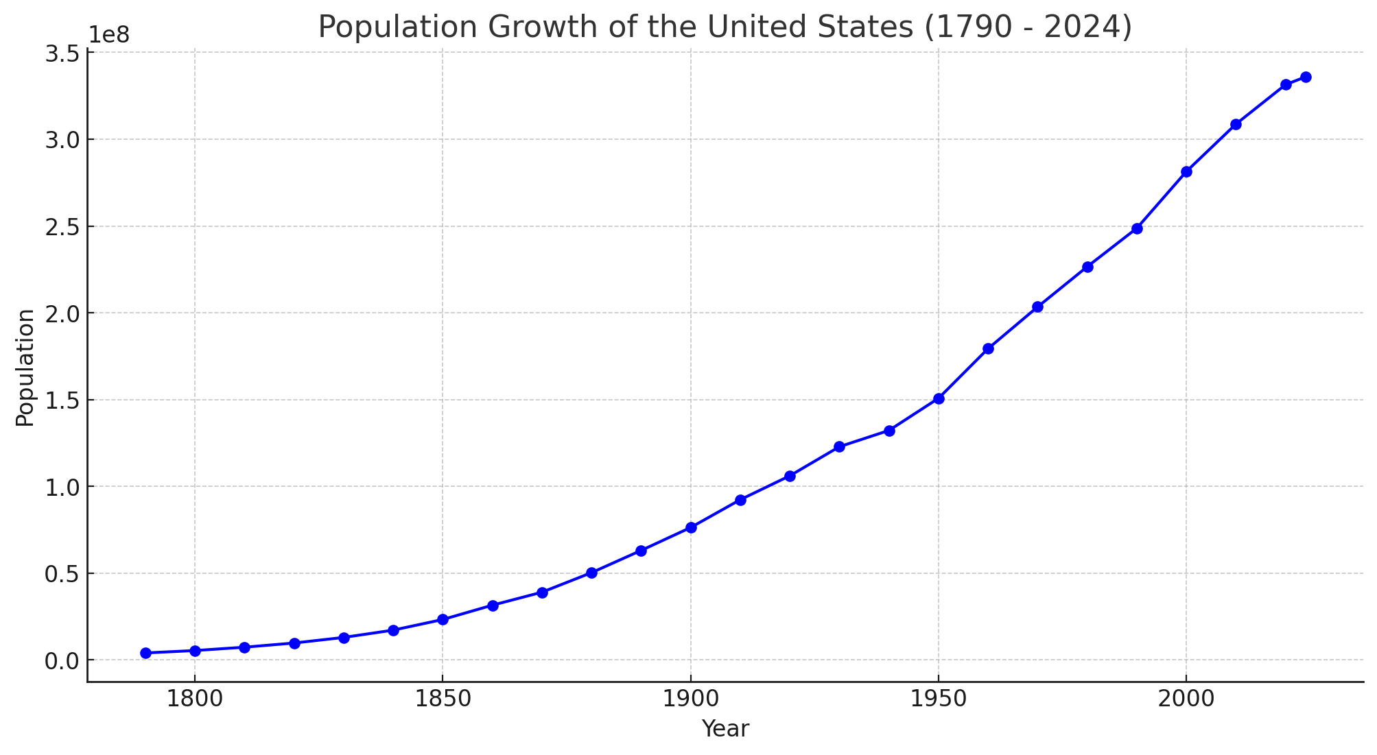
Population Growth In The United States (1790-2024)

<
Population Growth In The United States (1790-2024)
This line chart showing the population growth of the United States from 1790 to an estimated value for 2024. The chart highlights the significant increase in population over time, especially through periods of rapid growth in the 19th and 20th centuries, with continued growth into the 21st century.
Capital and Largest city: Washington, D.C, New York City
Official languages: English (None at the federal level)
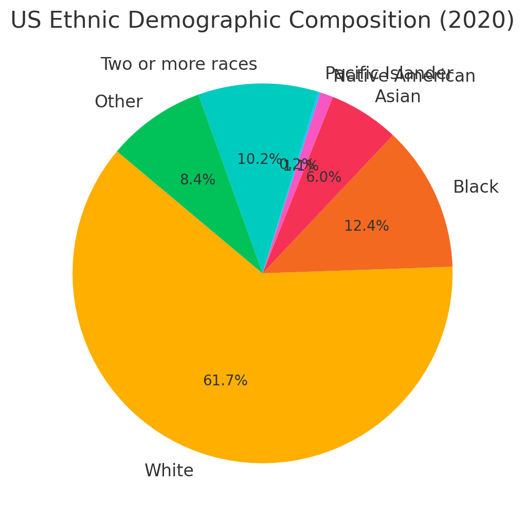
US Ethnic Demographic Composition (2020)

US Ethnic Demographic Composition (2020)
This pie chart showing the ethnic demographic composition of the United States based on 2020 data. This chart provides a visual breakdown of different ethnic groups, showing that white Americans make up the largest percentage, followed by black, Asian and other groups. The diverse racial composition reflects the multicultural nature of the US.
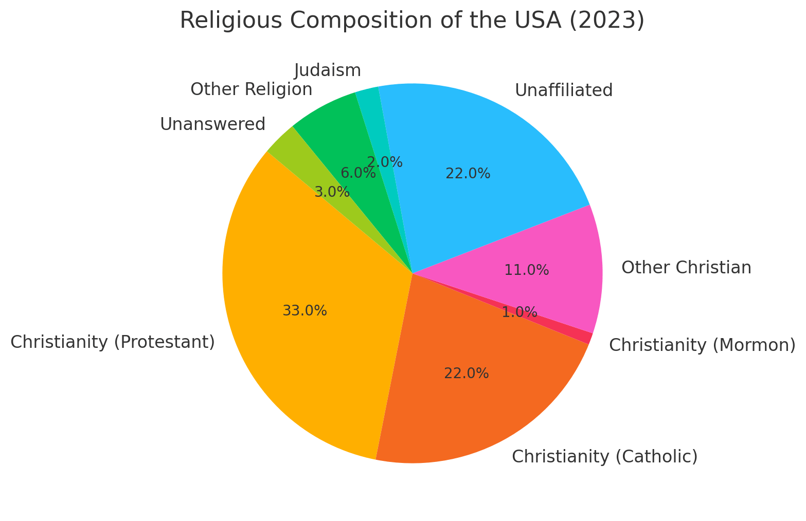
Religious Composition Of The USA (2023)
 Religious Composition Of The USA (2023)
This is a pie chart illustrating the religious composition of the United States in 2023. The largest category is Christianity, divided into Protestantism, Catholicism, Mormonism and other Christian affiliations. The unaffiliated group represents 22% of the population, reflecting the growing trend of people not identifying with a particular religion. Other religions and those who left the question unanswered make up the remaining segments, contributing to the overall diversity of religious beliefs in the US.
GDP (nominal): $29.168 trillion (2024 estimate)
Per capita: $86,601 (2024 estimate)
Currency: U.S. dollar ($) (USD)
Calling code: +1
Time zone: UTC−4 to −12, +10, +11
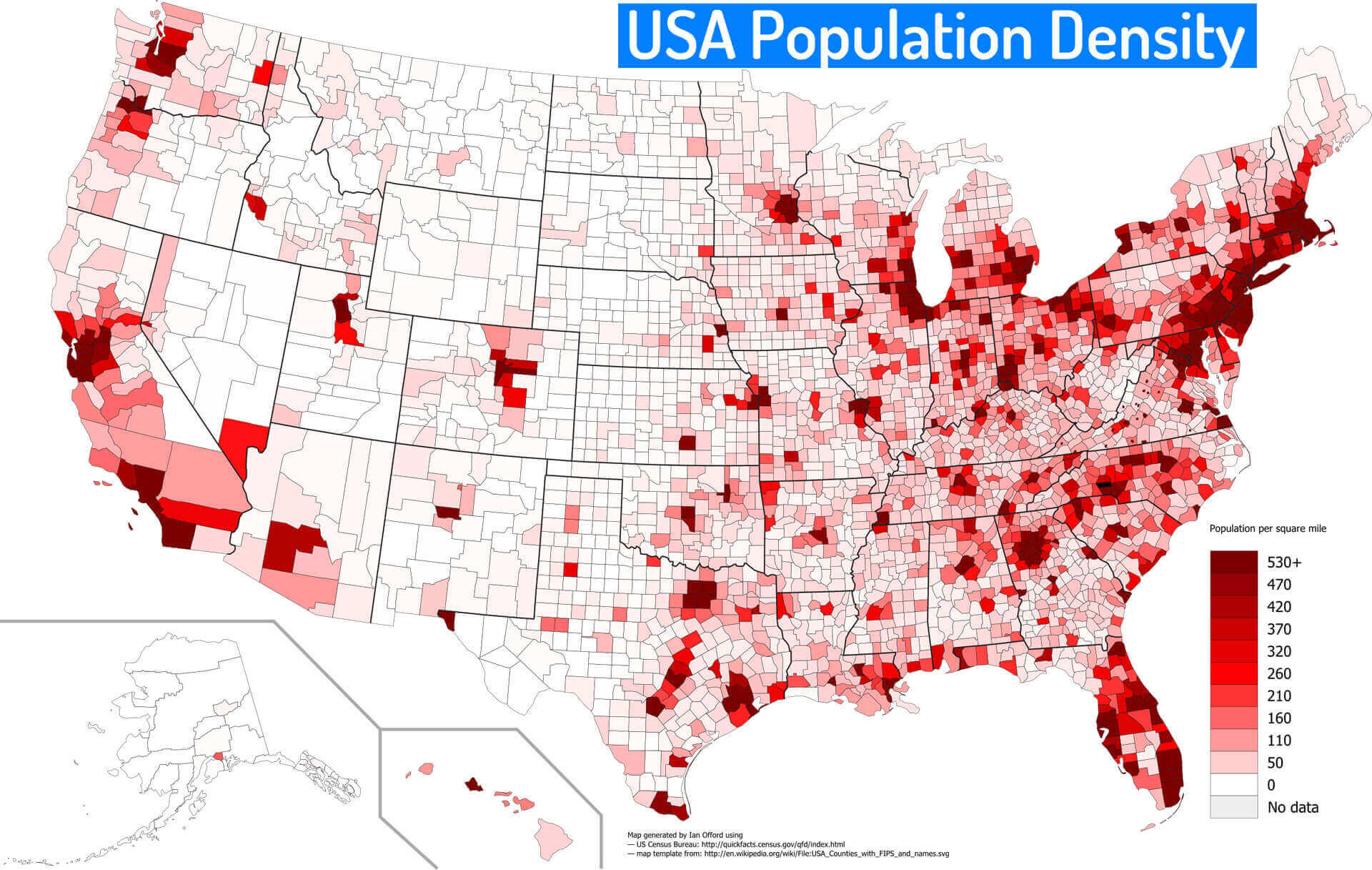
Population Density Map of the United States by County
 U.S. population density map by county in shades of red, based on persons per square mile.
This map shows U.S. population density by county, with red shades representing varying densities. Darker reds indicate highly populated counties, especially along the East Coast, parts of the Midwest, Texas, and California. Lighter shades represent lower-density areas, commonly found in the western and central parts of the country.
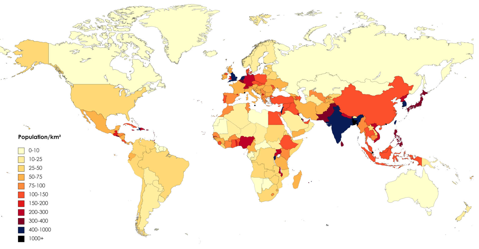
Global Population Density Map (2023) with the US
 2023 world population density map by country, showing population per square kilometer.
This map of 2023 shows global population density by country, measured in people per square kilometre.Darker colours represent higher densities, particularly in South Asia, parts of Europe and selected regions of the Americas. Lighter colours indicate sparsely populated areas, including parts of North America, Australia and northern Asia, highlighting the contrasts in population distribution around the world.
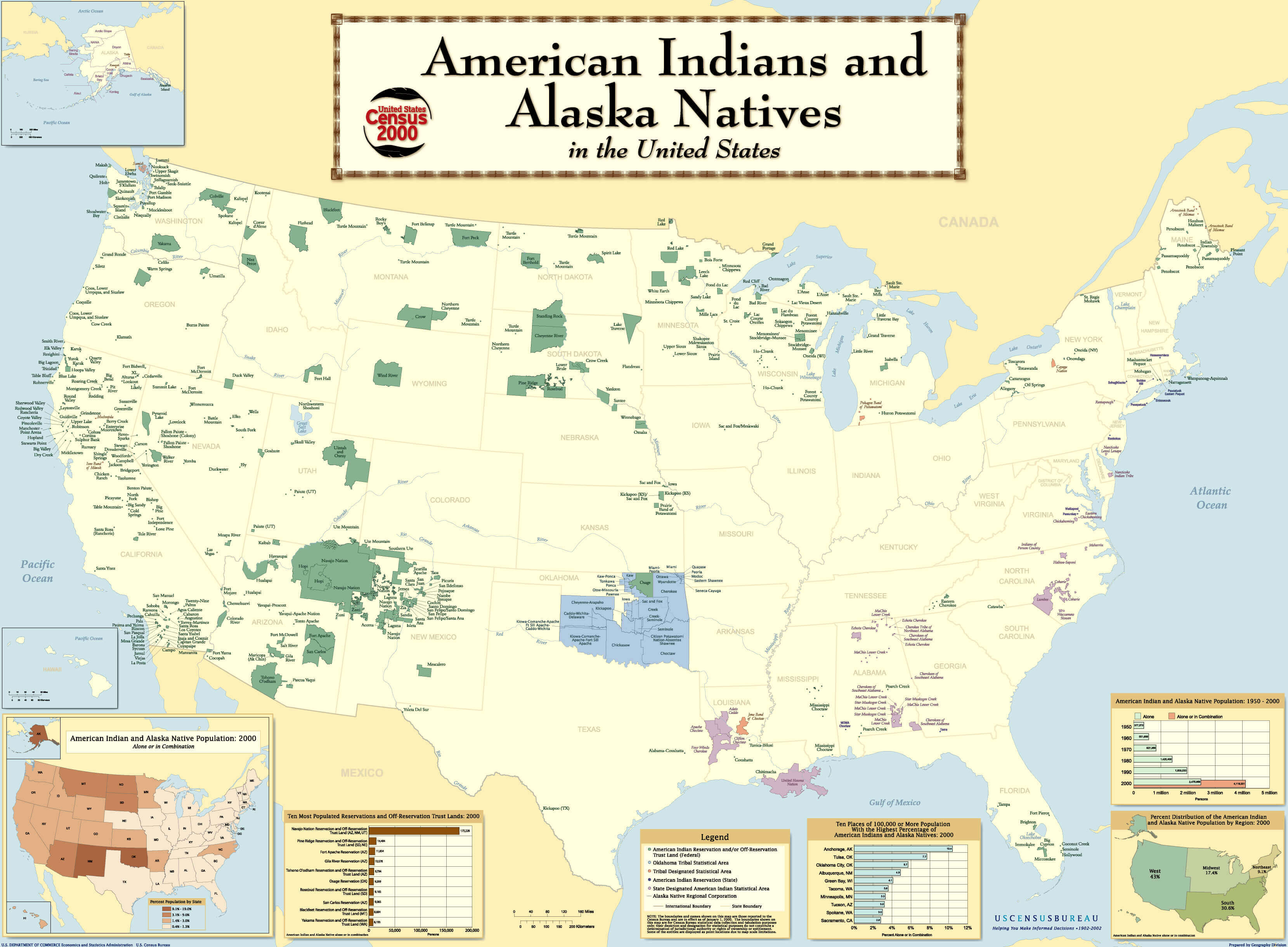
Map of American Indian and Alaska Native Reservations in the United States
 Map showing American Indian and Alaska Native reservations across the United States, indicating reservation locations, population data, and significant tribal lands.
This map provides a comprehensive view of the distribution of
American Indian and Alaska Native reservations in the
United States, based on data from the
2000 Census. It illustrates various tribal lands, reservations, and off-reservation trust lands, giving insight into the geographical presence and historical territories of Native American tribes. The map includes information on the most populated reservations and shows demographic changes from 1990 to 2000, highlighting the importance of these areas in preserving Native American culture and heritage.
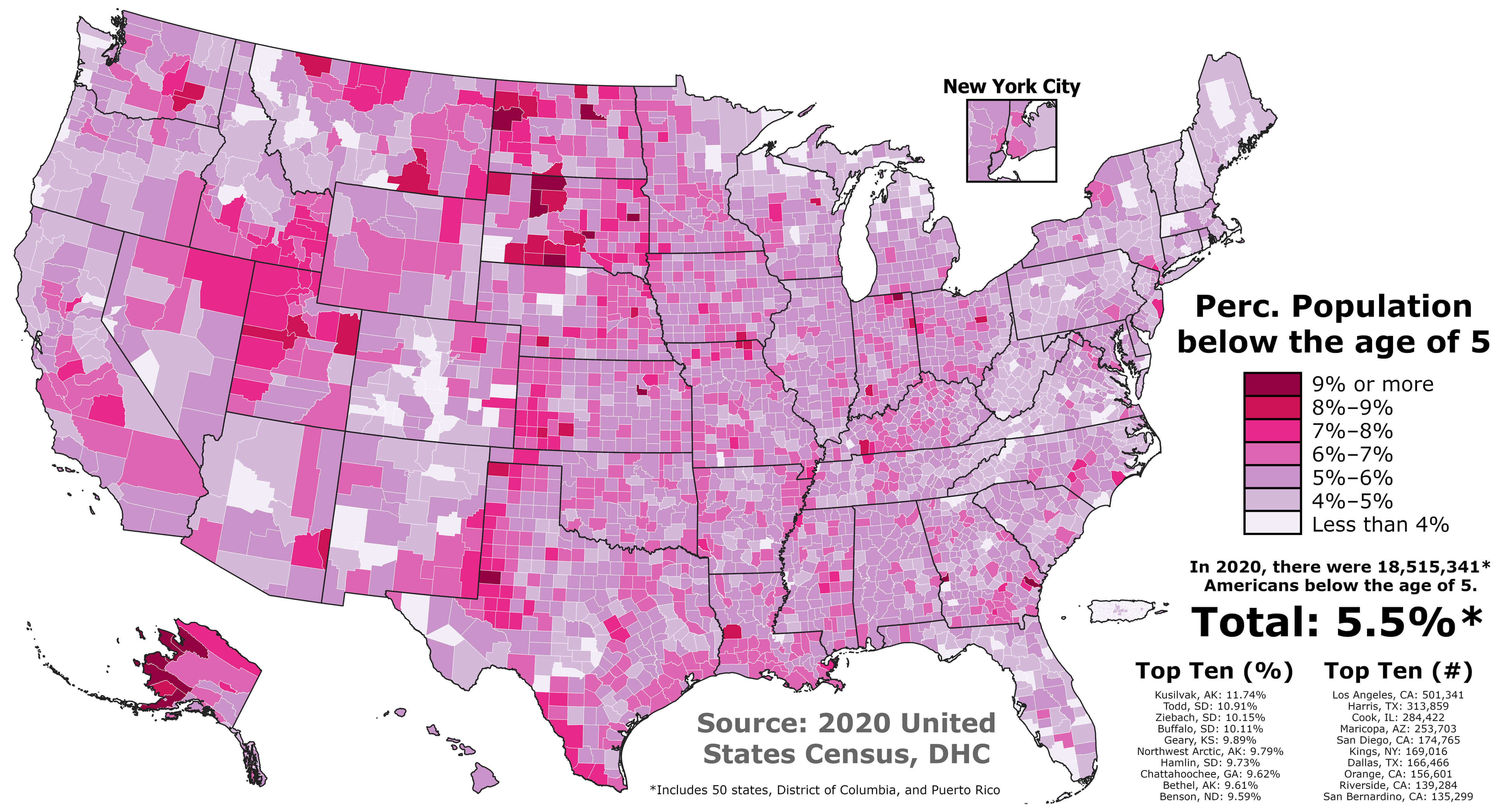
U.S. Population Under Age 5 by County (2020)
 Map of U.S. population under age 5 by county in 2020, shaded from light to dark pink.
This map shows the percentage of the U.S. population under age 5 by county based on the 2020 Census. Darker pink areas represent higher percentages of young children, with the highest concentrations in counties primarily in Alaska and South Dakota. Lighter pink regions indicate lower percentages, common in many urban and rural counties.
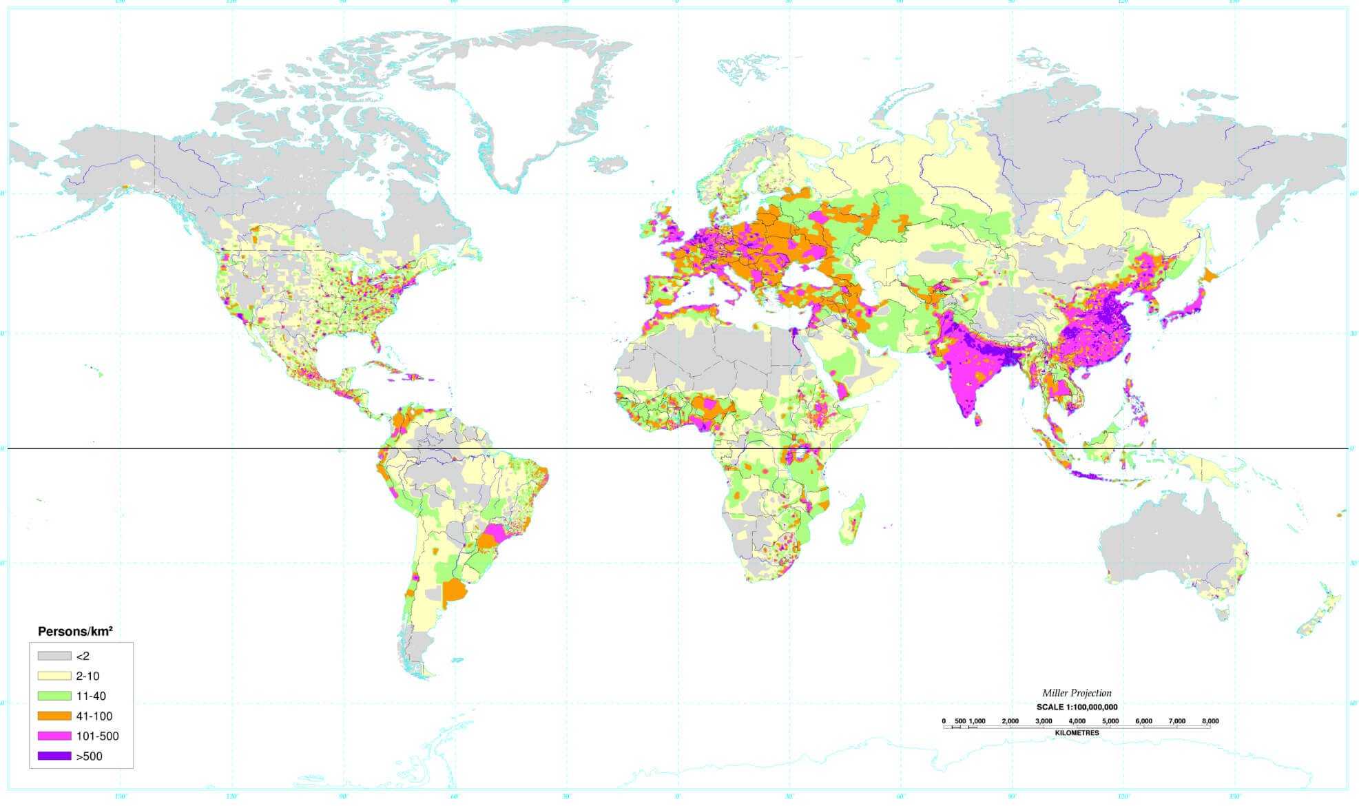
World Countries and United States Population Density Map by Country and Region (1994)
 1994 world population density map showing density by country and U.S. regions.
This 1994 map shows population density in world regions and US counties, with colours ranging from grey (sparsely populated) to purple (densely populated). High population densities are found in South and East Asia, parts of Europe and the eastern United States, while large parts of Africa, South America and Australia have low population densities.
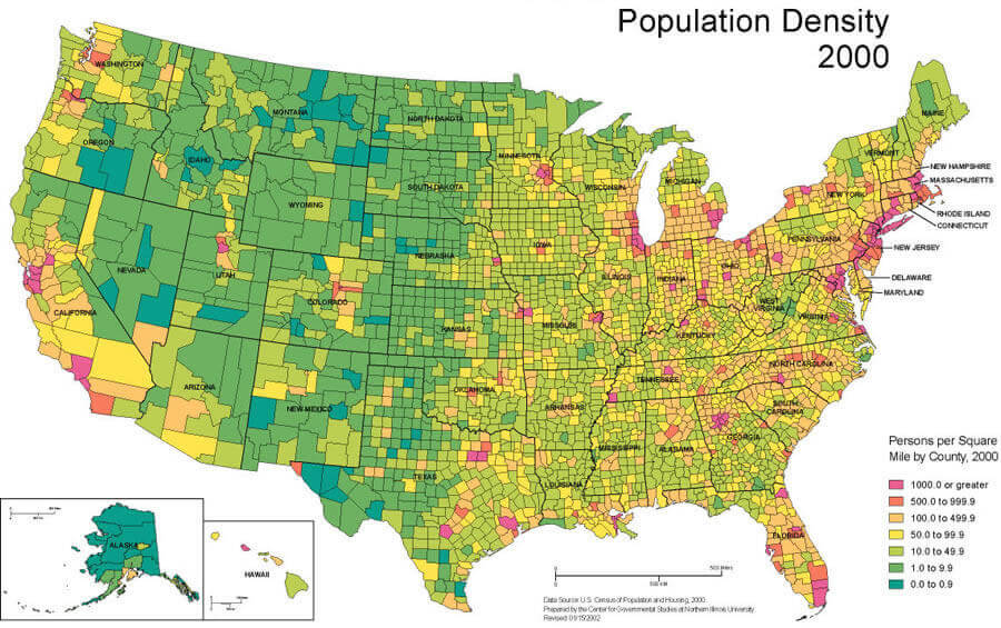
Population Density Map of the United States in 2000
 Population density map of the United States by county in the year 2000.
This map shows the population density of US counties in 2000, measured in persons per square mile. Darker colours represent higher population densities, particularly in the Northeast, Midwest, and parts of the West Coast, while lighter colours indicate sparsely populated areas in the West and Midwest.
Topographic and Population Density Map of the United States 2024
 Topographic map of the United States in 2024 showing population density and major highways.
This map of the United States combines topographic features with population density and major roads. Green shading indicates lower elevations and denser population, especially in the eastern states, while brown and beige indicate higher elevations in the western states. Major cities and highways are also highlighted.
2018 Population Density Map of the United States
 2018 U.S. population density map by county, showing density in persons per square kilometer.
This 2018 U.S. population density map, based on Census Bureau data, highlights population concentration by county. Darker shades of red indicate densely populated areas, particularly along the coasts and urban centers. In contrast, lighter colors show sparsely populated regions, notably in the western and central areas.
Population Density by U.S. State in 2020
 2020 U.S. population density map by state, shaded in blue tones by persons per square mile.
This map shows the population density of the US states and territories in 2020, measured in people per square mile. Darker shades of blue represent more densely populated areas, particularly along the East Coast, while lighter shades indicate sparsely populated areas, particularly in the western states. This gradient highlights the differences in population concentration across the country.
Population Density by U.S. County
 U.S. population density map by county, shaded in blue tones by population size.
This map shows the population density of U.S. counties, with varying blue shades representing different population sizes. Darker shades indicate highly populated counties, notably in California, Texas, Florida, and the Northeast, while lighter shades mark sparsely populated areas, particularly in the Midwest and West.
U.S. Population Density Change by County (1990 – 2022)
 Map showing population density change in U.S. counties from 1990 to 2022 in color scale.
This map shows the percentage change in population density in US counties from 1990 to 2022. Counties with high growth are shown in red and orange, particularly in the West and South, while areas with population decline are shown in shades of blue, particularly in parts of the Midwest and Northeast.
Population Density of U.S. States (2023)
 2023 U.S. population density map by state, color-coded from low to high density.
This map displays the population density of U.S. states in 2023, measured in persons per square mile. Darker colors represent states with higher population densities, such as New Jersey, Massachusetts, and California, while lighter shades indicate sparsely populated states like Alaska, Wyoming, and Montana. This visualization highlights population concentration differences across the country.
U.S. Population Density Heat Map (2000 – 2020)
 U.S. population density heat map (2000-2020) showing changes in density by region.
This heat map illustrates changes in US population density from 2000 to 2020. Areas of increasing density are shown in warm colours (yellow to red), particularly around major cities, while areas of decreasing density are shown in cool colours (blue to purple), particularly in rural areas. The map highlights urban growth and rural depopulation trends across the country.
Population Density Map of the United States and Canada
 Population density map of the U.S. and Canada, color-coded by people per square mile.
This map shows population density in the United States and Canada. Highly populated areas, shown in red, are concentrated in the eastern US and southern Canada, while large areas of Canada, particularly in the north, have very low population density, shown in dark green. This highlights the high population concentration near the US-Canada border compared to the sparsely populated northern areas.
Global World Countries Population Density Map by Country (2006) with the US
 2006 population density map by the World countries with the United States, showing density levels from low to high.
This map illustrates population density by country in 2006, with color coding from light to dark brown. Darker shades indicate high-density areas, especially in South Asia (China, India), Western Europe (Germany, United Kingdom, Netherlands), and parts of Africa, while lighter shades show sparsely populated regions, such as North America (United States, Mexico, and Canada) and Australia. This visualization highlights the global variations in population concentration.
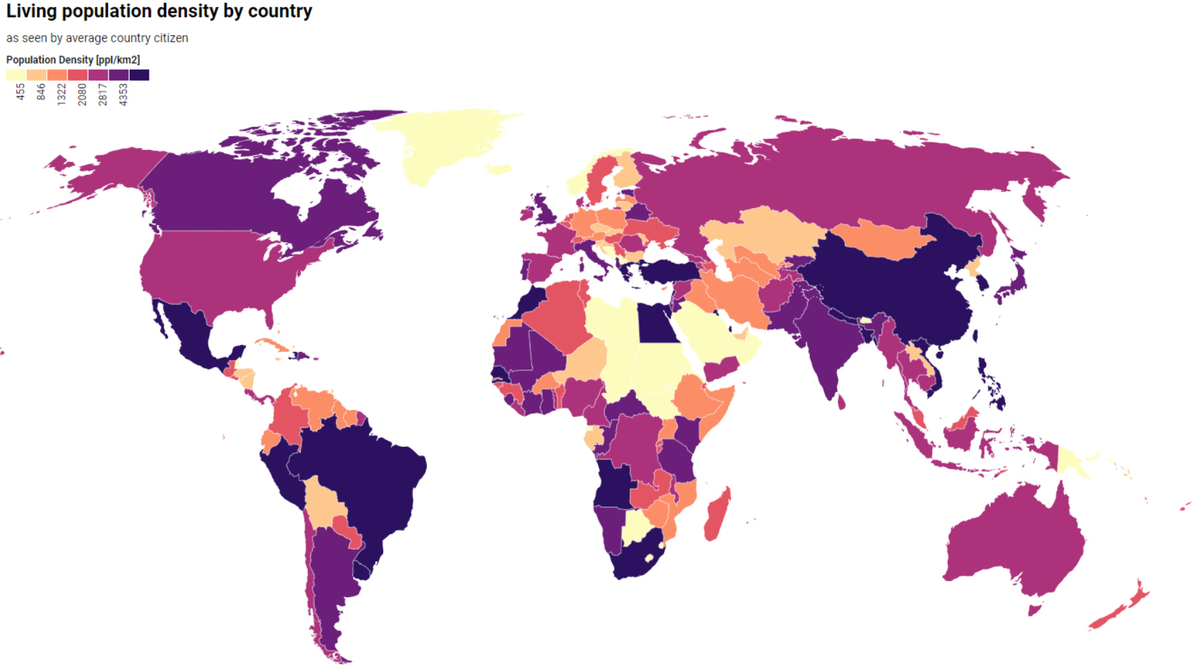
World and United States of America Living Population Density Map by Country
 World and USA map showing living population density by country, color-coded by density levelsş
This map illustrates population density by country, showing how densely populated each nation appears from the perspective of the average citizen. High-density areas are shown in dark purple, particularly in South Asia and parts of Europe, while lighter shades represent lower densities, such as in Canada and parts of northern Europe. The colour gradient reflects global variations in density.
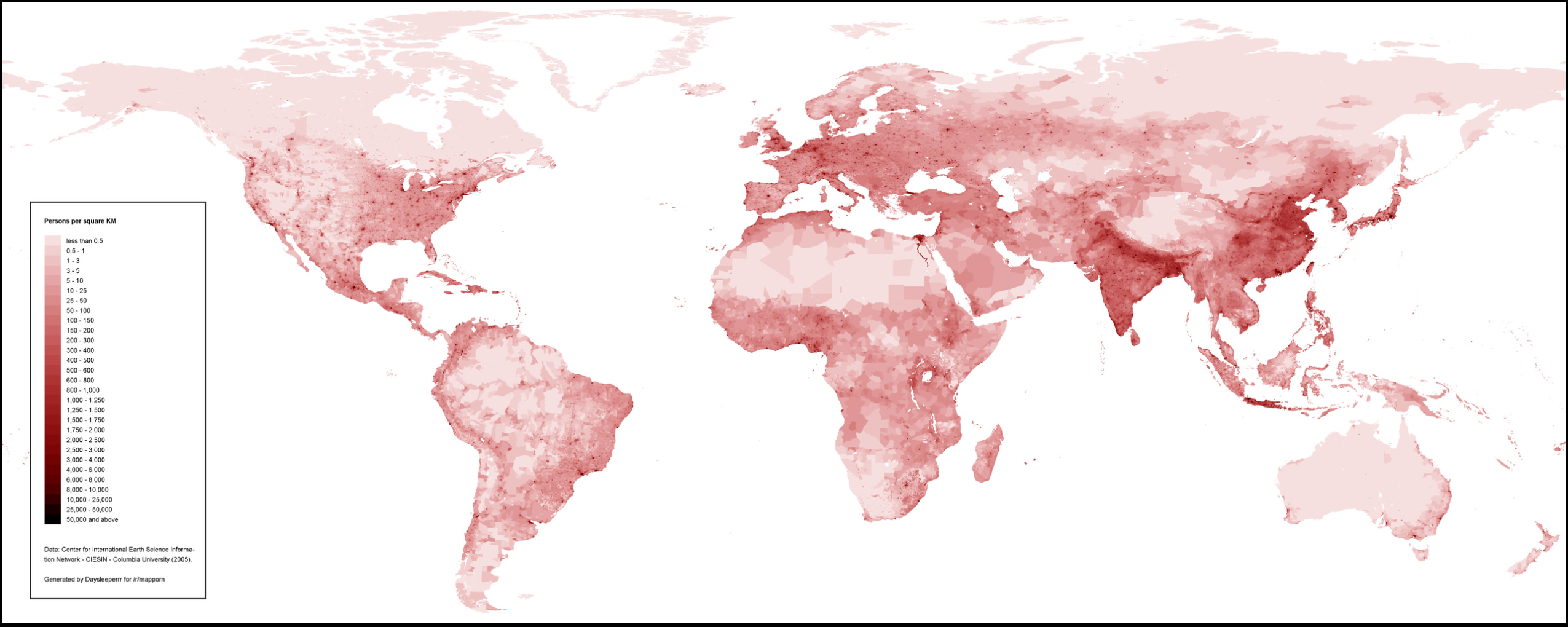
The World Population Density Map Including the United States
 World population density map with the United States, shaded from light to dark red by density.
This map displays global population density, with shading from light to dark red to indicate varying levels of people per square kilometer. High-density regions, such as South Asia and parts of Europe, are marked in darker shades, while sparsely populated areas like northern Canada, Australia, and the Sahara are lighter. The map highlights major population concentrations worldwide.
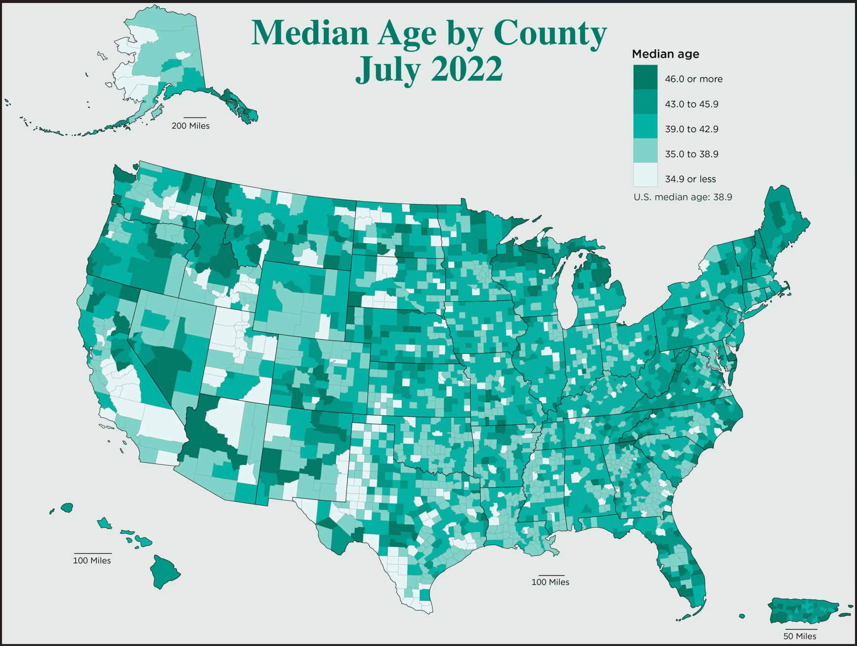
Median Age Map by U.S. County (July 2022)
 Map of median age by county in the U.S. for July 2022, shaded by age groups.
This map shows the median age of US counties in July 2022. Darker shades represent higher median ages (46+), concentrated in areas such as the Midwest and rural counties, while lighter shades represent younger median ages (34.9 or less), more common in urban areas and the South. The median age in the US is 38.9 years.
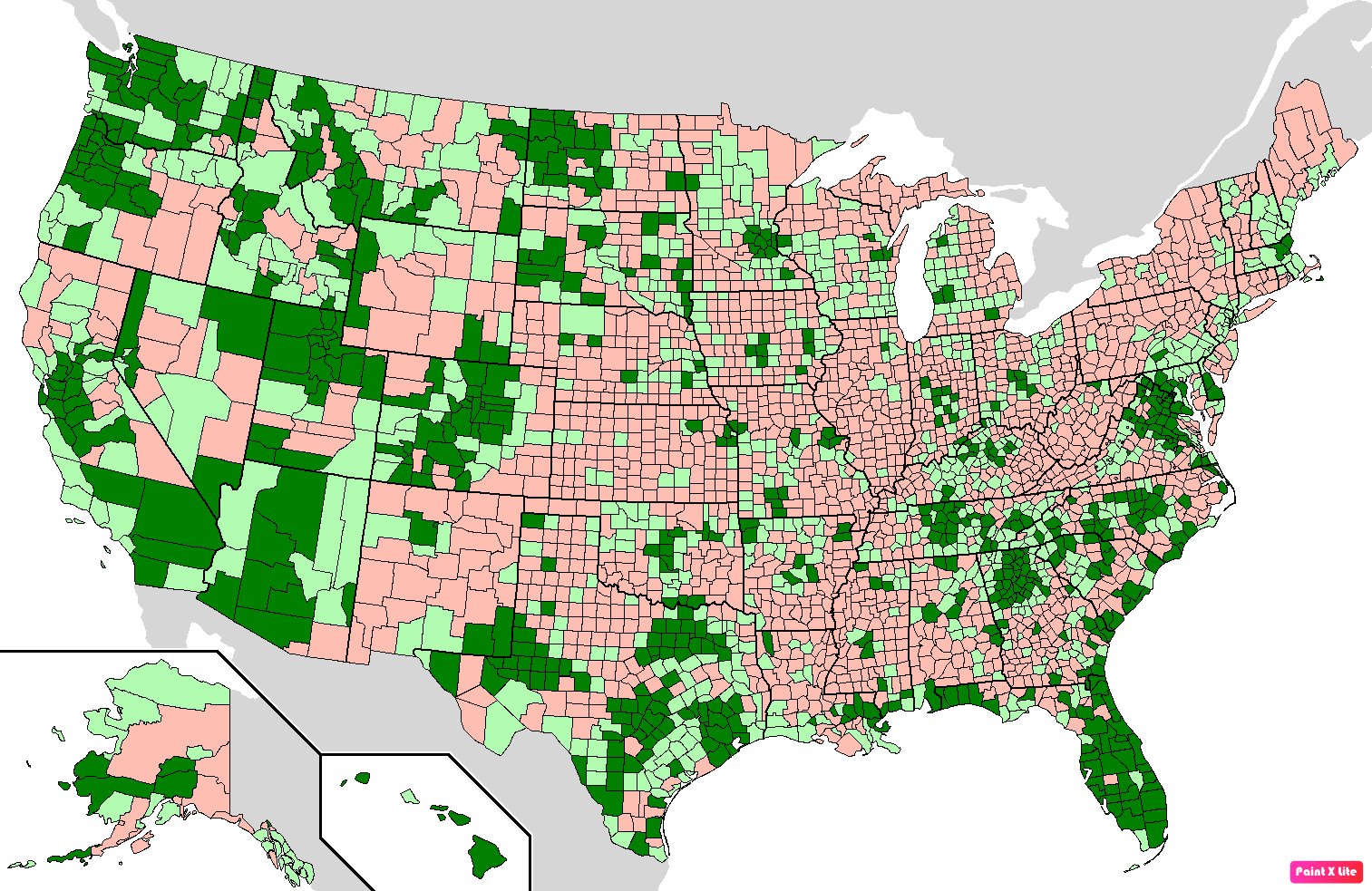
U.S. Counties by Population Growth
 Map of U.S. counties showing population growth trends, with growth marked in green shades.
This map highlights U.S. counties by population growth, using shades of green for growth and shades of pink for decline. Darker green areas represent counties with significant population increases, while darker pink indicates counties with notable decreases. The map visually contrasts growing urban and suburban areas with regions experiencing population decline.
U.S. States Residents Population Map in 2018
 Map showing U.S. states by resident population in 2018 with color-coded differences.
This map shows the resident population of US states in 2018, using different shades of green and pink to indicate differences in population levels. Darker green areas represent more populous states, while lighter shades of green and pink represent less populous states.
U.S. Population Under Age 18 by County (2020 Census)
 Map showing percentage of population under 18 in U.S. counties based on 2020 census data.
This map depicts the percentage of US residents under the age of 18 by county, based on data from the 2020 Census. Darker shades of purple represent counties with higher percentages of young residents, concentrated in parts of the West and Midwest. Lighter shades represent counties with lower percentages, concentrated in the Northeast and Midwest.
Age Distribution of U.S. Population 65 and Older vs. 17 and Younger by County (2020)
 Map comparing population percentages of those 65+ and under 17 in U.S. counties (2020).
This map shows the distribution of U.S. counties based on the estimated percentage of residents aged 65 and older compared to those 17 and younger in 2020. Blue shades indicate areas with a higher percentage of elderly residents, while green shades denote higher percentages of young residents. Brown represents areas with more balanced age groups.
U.S. Population Density by Square Kilometer (2010)
 Map of U.S. population density per square kilometer based on 2010 census data.
This map shows population density in the United States in 2010, measured in persons per square kilometre. Areas with higher densities, especially urban areas, are shown in red, indicating more than 1,000 people per square kilometre. Light-coloured areas show lower densities, while uninhabited areas are shown in light grey.
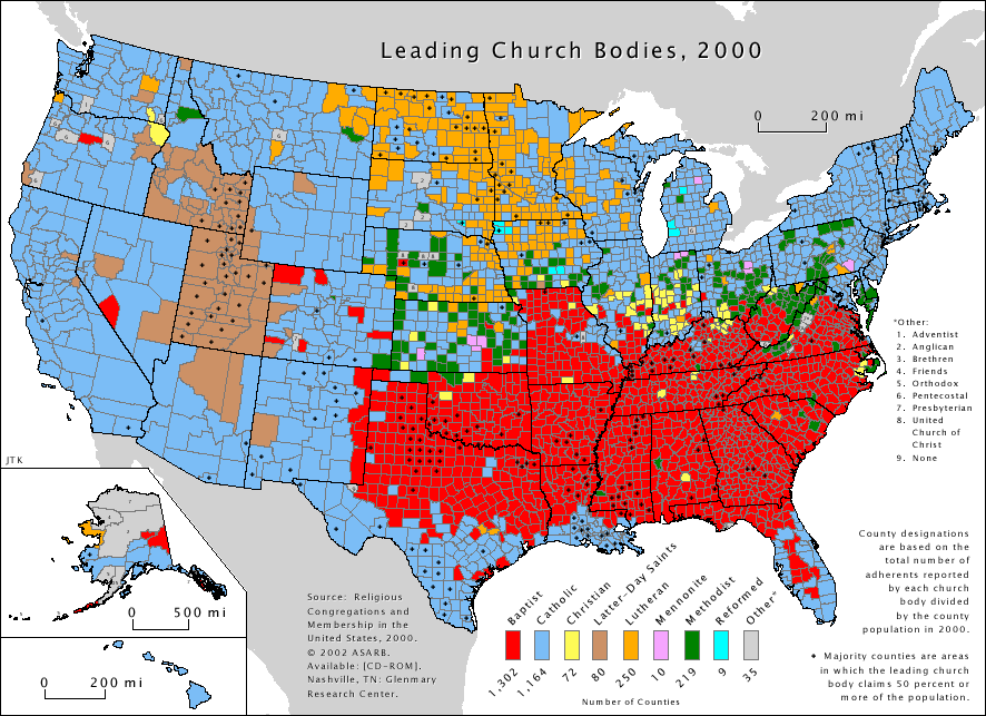
Religious Denominations Across the United States (2000)
 Map of the leading religious denominations by county in the U.S. as of 2000.
This map displays the predominant religious affiliation of US counties in 2000. Major denominations include Baptist (red), Catholic (blue) and Lutheran (green), with other groups represented by different colours. The map highlights regional trends, such as Baptist dominance in the South and Catholic presence in the Northeast and Southwest.
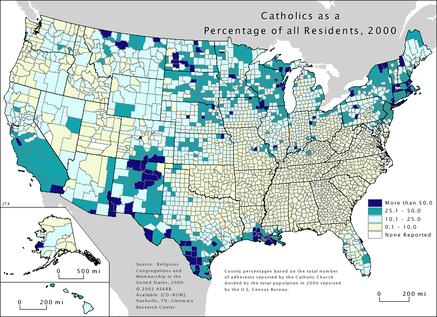
Catholic Population Distribution in the United States (2000)
 Map of Catholic population percentage by county in the U.S. as of 2000.
This map presents the distribution of Catholics as a percentage of the total population by county in the United States in 2000. Darker shades indicate higher concentrations, with Catholic populations exceeding 50% in some areas, notably the Northeast and parts of the Southwest, while many counties have little or no Catholic presence.
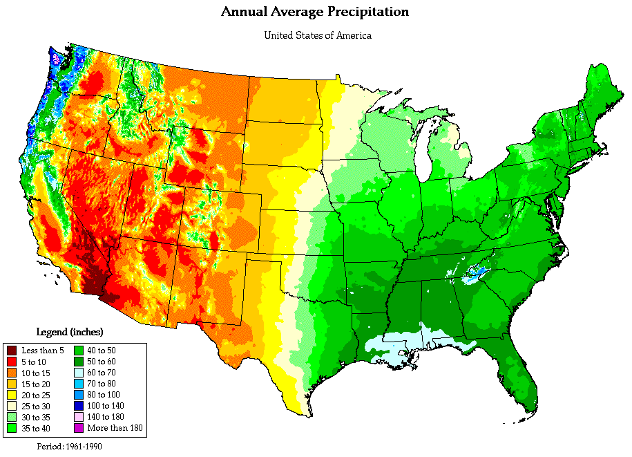
Annual Average Precipitation Across the United States
 Map of annual average precipitation in the U.S. with varying intensities by region.
This map illustrates the average annual precipitation across the United States from 1961 to 1990. Regions in the Pacific Northwest and parts of the Southeast receive the most rainfall, shown in dark green and blue, while arid areas in the Southwest receive the least, shown in red and orange.
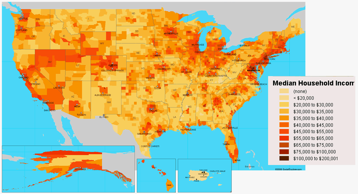
Median Household Income Across the United States
 Map showing median household income by county in the United States.
This map highlights economic disparities by showing the median household income in US counties. Regions are colour-coded from light yellow (income below $20,000) to dark brown (income above $100,000). Coastal areas, urban centers and parts of the Midwest have higher incomes, while rural and southern areas generally have lower incomes.
Where is Located the United States on the World Map?
Show the United States Google interactive map, satellite map, where is the country located.
Get directions by driving, walking, bicycling, public transportation, and traveling with street view.
Feel free to explore US states maps:
- Advertisement -
 U.S. population density map by county, shaded from green to red by density per square mile
 U.S. block-level population density map showing people per block.
 Golden Gate Bridge, San Francisco, California – United States
 Where is the United States on the World Map
 <
Population Growth In The United States (1790-2024)
 Religious Composition Of The USA (2023)
 U.S. population density map by county in shades of red, based on persons per square mile.
 2023 world population density map by country, showing population per square kilometer.
 Map showing American Indian and Alaska Native reservations across the United States, indicating reservation locations, population data, and significant tribal lands.
 Map of U.S. population under age 5 by county in 2020, shaded from light to dark pink.
 1994 world population density map showing density by country and U.S. regions.
 Population density map of the United States by county in the year 2000.
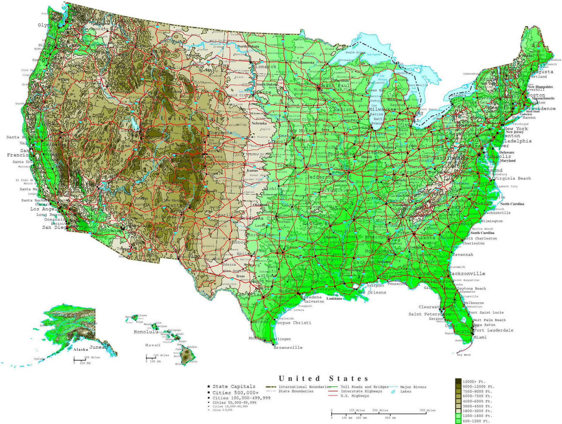 Topographic map of the United States in 2024 showing population density and major highways.
 2018 U.S. population density map by county, showing density in persons per square kilometer.
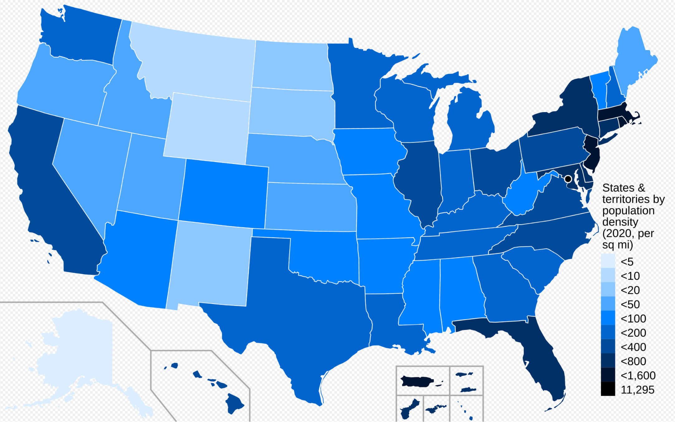 2020 U.S. population density map by state, shaded in blue tones by persons per square mile.
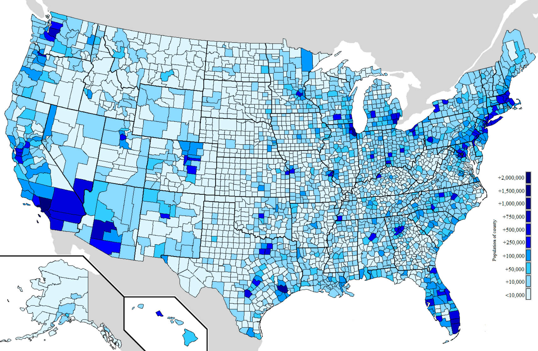 U.S. population density map by county, shaded in blue tones by population size.
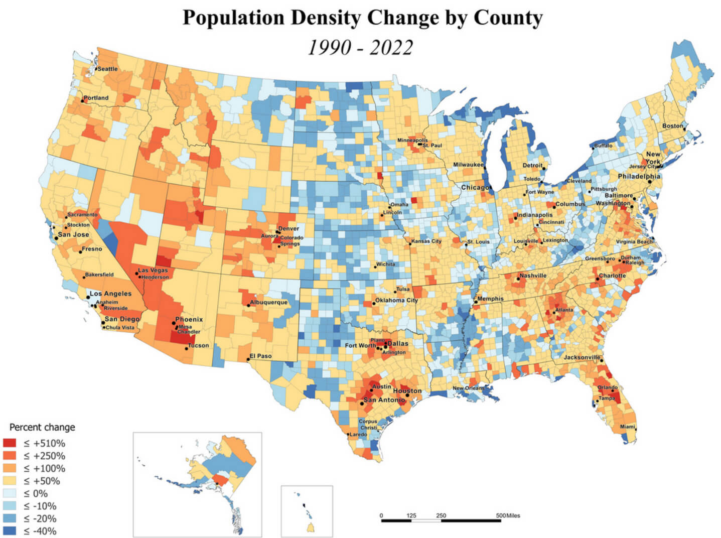 Map showing population density change in U.S. counties from 1990 to 2022 in color scale.
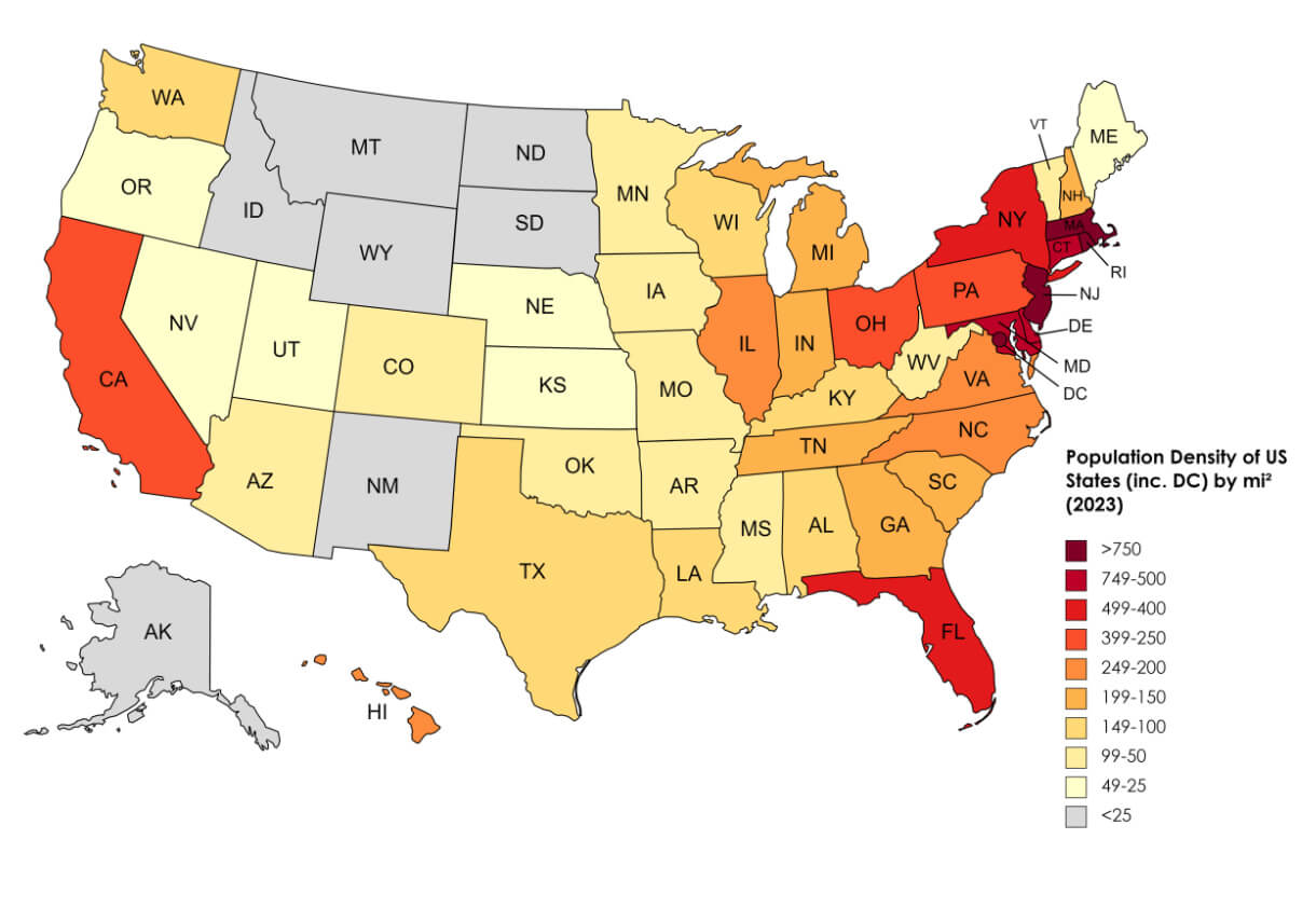 2023 U.S. population density map by state, color-coded from low to high density.
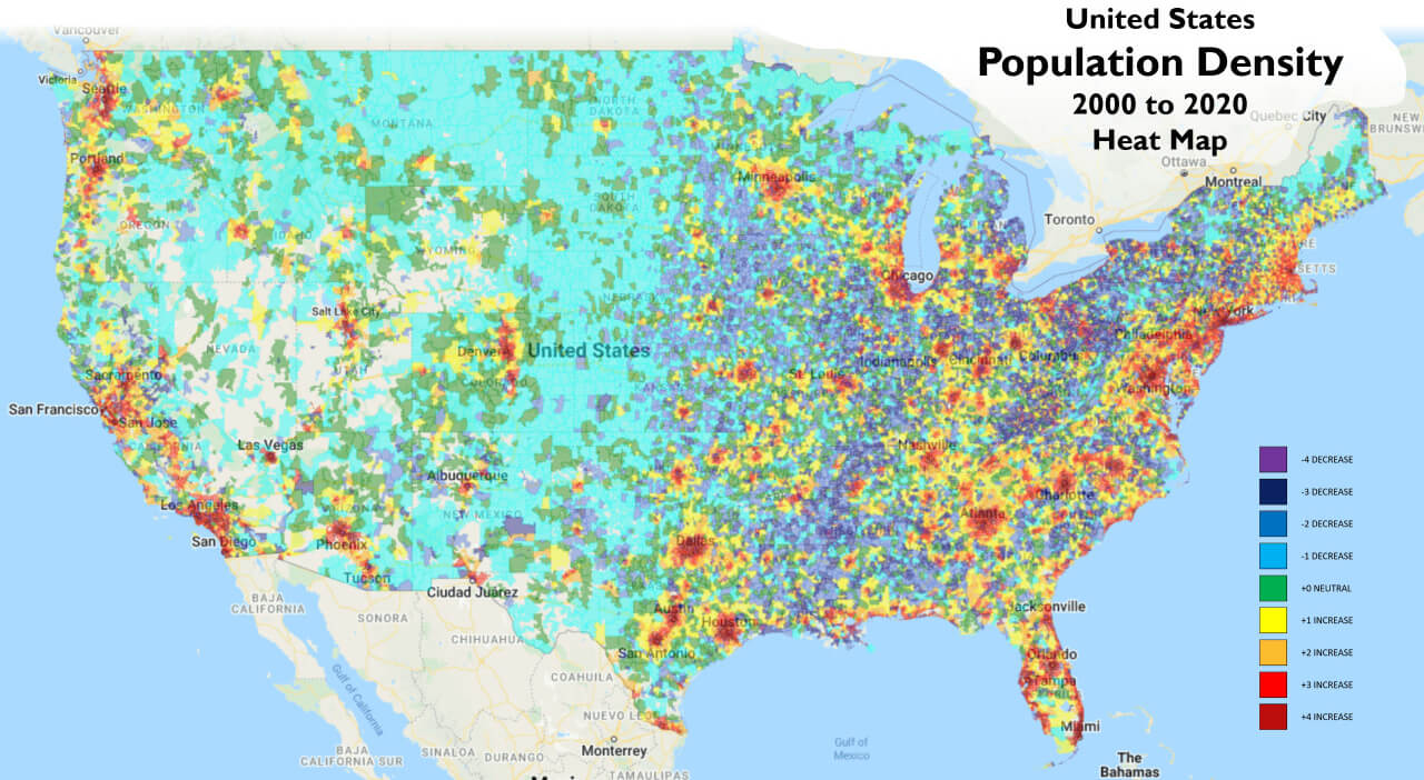 U.S. population density heat map (2000-2020) showing changes in density by region.
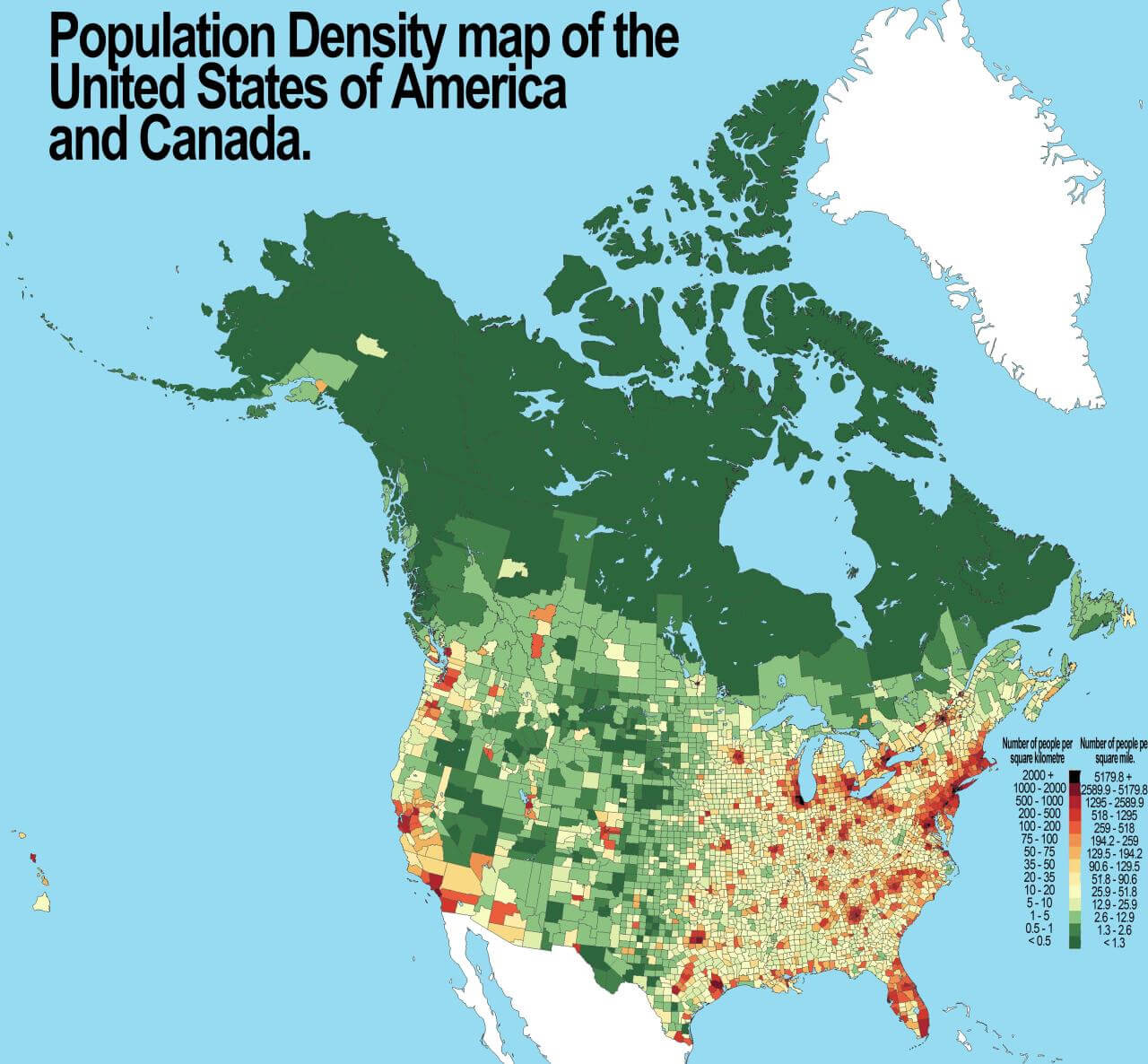 Population density map of the U.S. and Canada, color-coded by people per square mile.
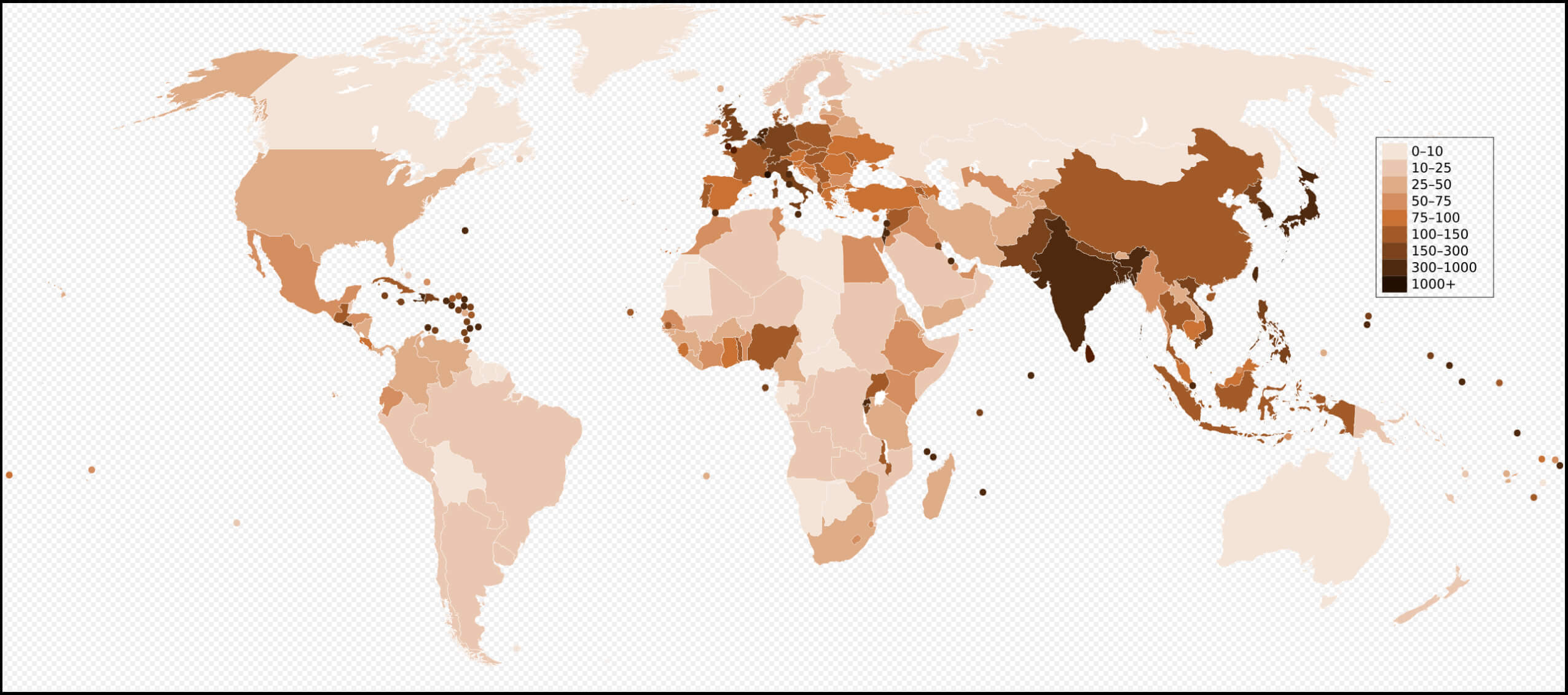 2006 population density map by the World countries with the United States, showing density levels from low to high.
 World and USA map showing living population density by country, color-coded by density levelsş
 World population density map with the United States, shaded from light to dark red by density.
 Map of median age by county in the U.S. for July 2022, shaded by age groups.
 Map of U.S. counties showing population growth trends, with growth marked in green shades.
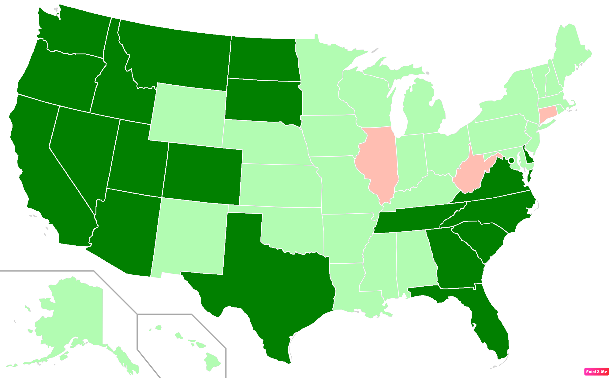 Map showing U.S. states by resident population in 2018 with color-coded differences.
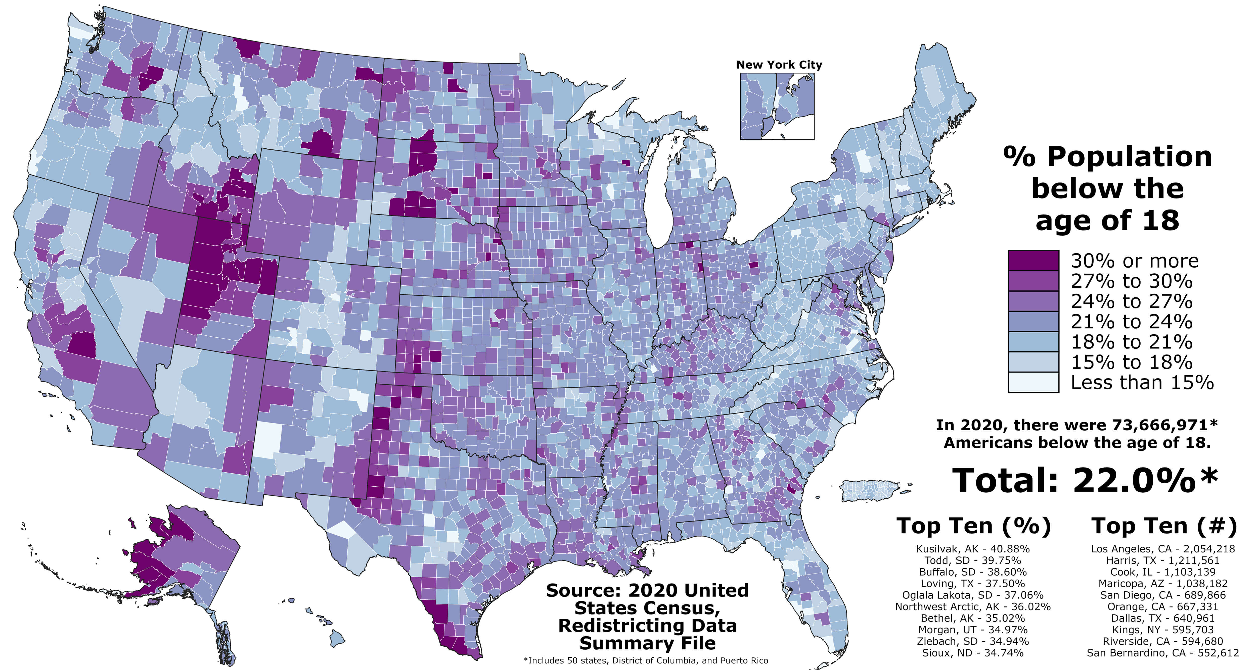 Map showing percentage of population under 18 in U.S. counties based on 2020 census data.
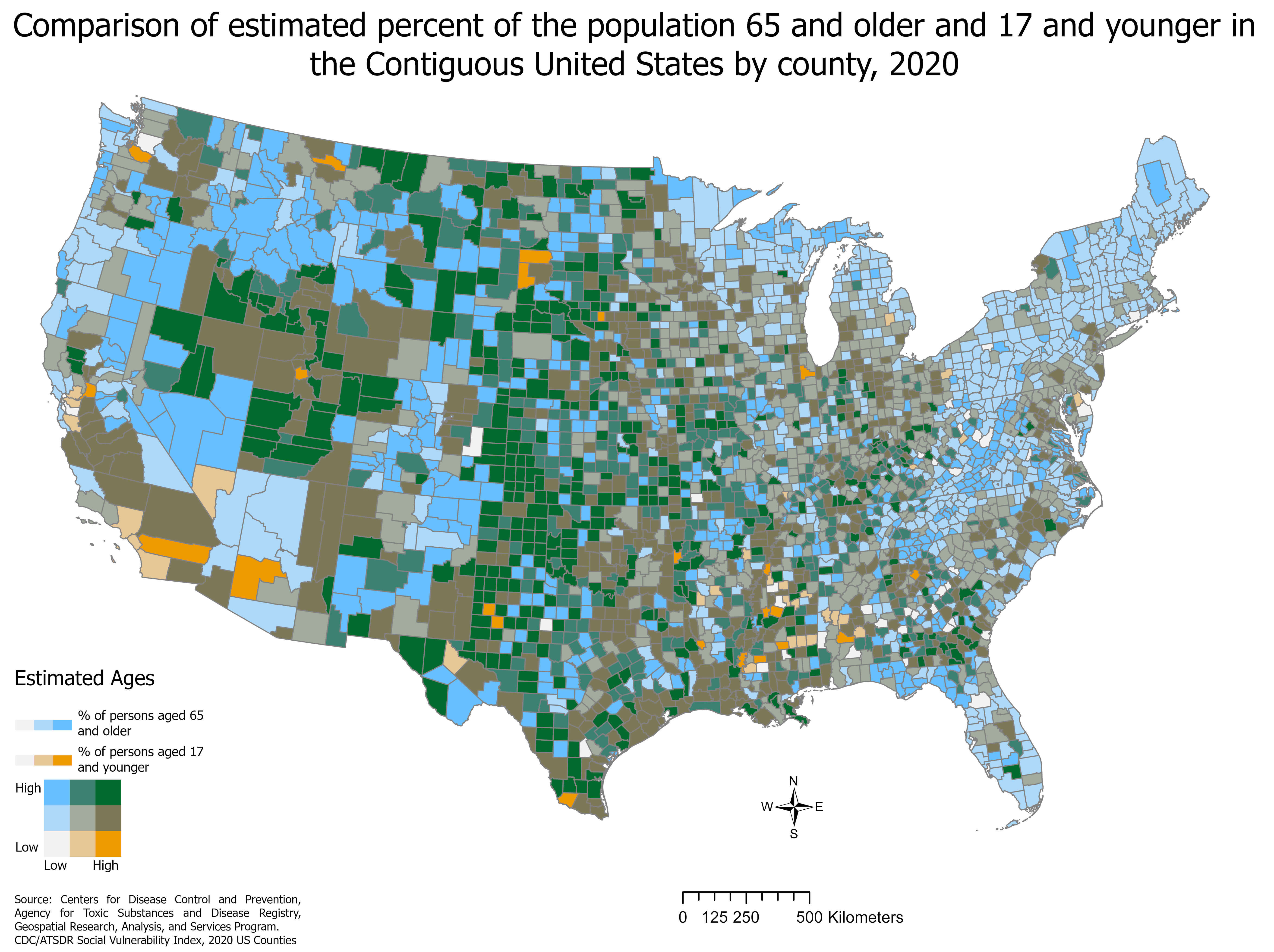 Map comparing population percentages of those 65+ and under 17 in U.S. counties (2020).
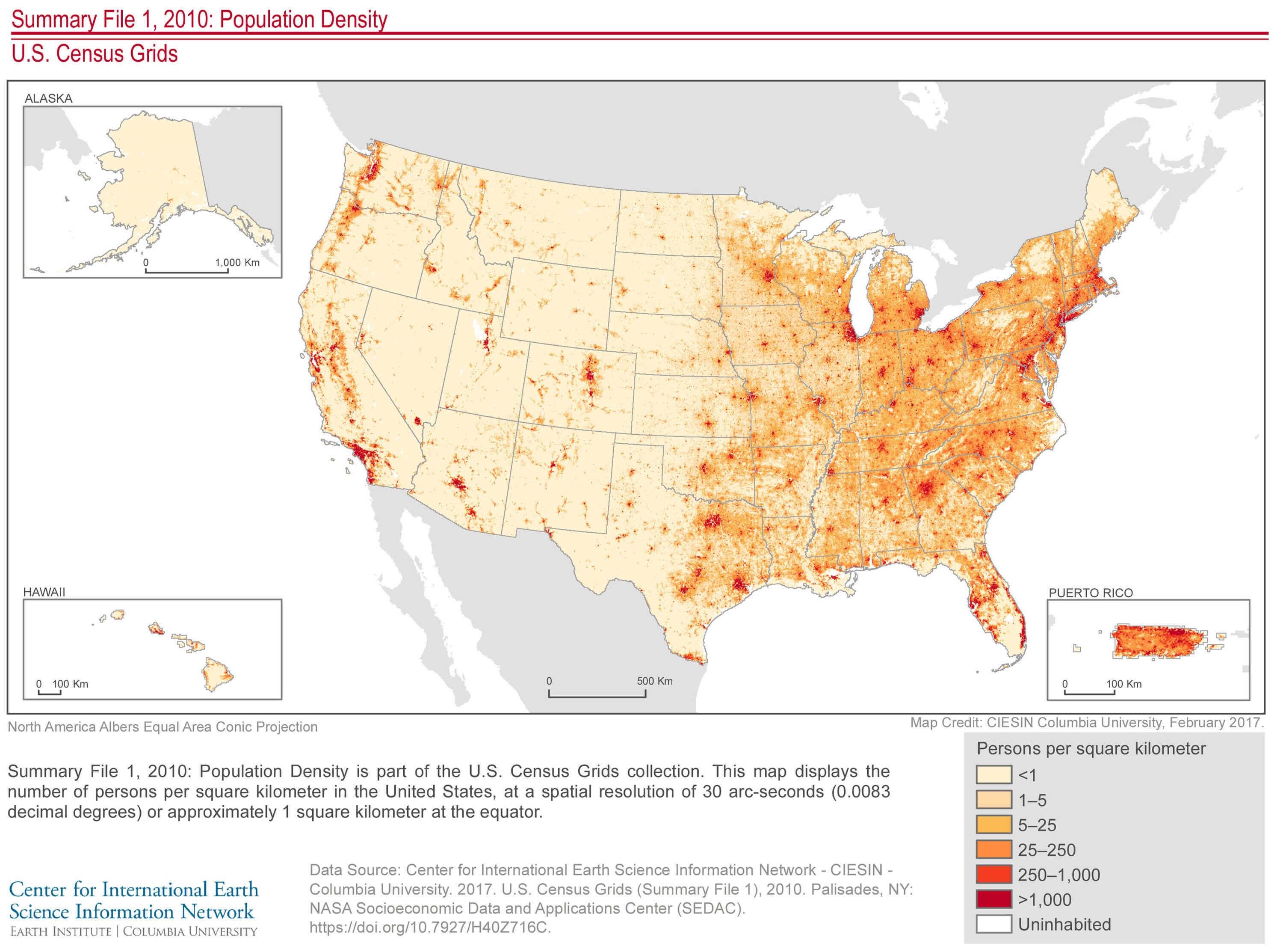 Map of U.S. population density per square kilometer based on 2010 census data.
 Map of the leading religious denominations by county in the U.S. as of 2000.
 Map of Catholic population percentage by county in the U.S. as of 2000.
 Map of annual average precipitation in the U.S. with varying intensities by region.
 Map showing median household income by county in the United States.